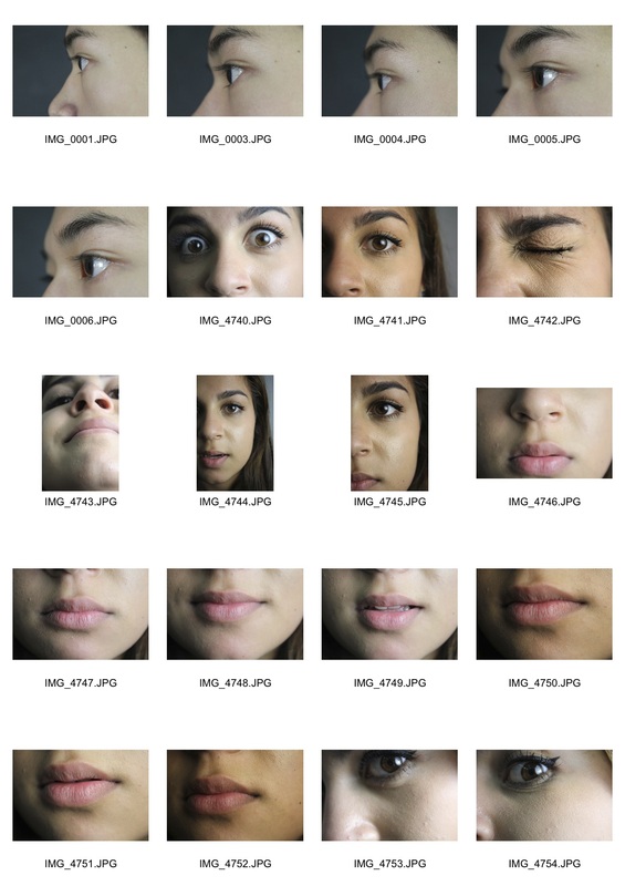
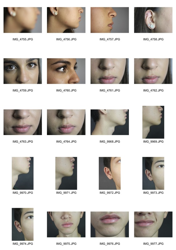
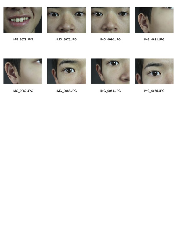
What is a portrait?
A portrait is a painting, photograph, sculpture, or other artistic representation of a person, in which the face and its expression is predominant. The intent is to display the likeness, personality, and even the mood of the person.
Checking out me history - John Agard
John Agard was born in British Guyana in the Caribbean, in 1949. He moved to the UK in the late 1970s and is well known for powerful and fun performances of his work. He uses non-standard phonetic spelling (written as a word sounds) to represent his own accent, and writes about what it is like being black to challenge racist attitudes, especially those which are unthinking. He conveys the one sided, exclusively British history he had learned in school. Agard talks about how he was forced to follow a biased, incomplete history syllabus which made him feel alienated form his white peers therefore challenging the way history is taught and therefore how he is learnt to be perceived. We learn that he had growing frustrations about the fact he was taught about mythical, nursery rhyme characters in school rather than influential, historical black figures, like Mary Seacole. Agard intentionally used incorrect, phonetic spelling to convey his accent, challenging the traditional language and grammar used in poetry.
|
Dem tell me
Dem tell me Wha dem want to tell me Bandage up me eye with me own history Blind me to me own identity Dem tell me bout 1066 and all dat dem tell me bout Dick Whittington and he cat But Toussaint L’Ouverture no dem never tell me bout dat Toussaint a slave with vision lick back Napoleon battalion and first Black Republic born Toussaint de thorn to de French Toussaint de beacon of de Haitian Revolution Dem tell me bout de man who discover de balloon and de cow who jump over de moon Dem tell me bout de dish ran away with de spoon but dem never tell me bout Nanny de maroon |
Nanny
seefar woman of mountain dream firewoman struggle hopeful stream to freedom river Dem tell me bout Lord Nelson and Waterloo but dem never tell me bout Shaka de great Zulu Dem tell me bout Columbus and 1492 but what happen to de Caribs and de Arawaks too Dem tell me bout Florence Nightingale and she lamp and how Robin Hood used to camp Dem tell me bout ole King Cole was a merry ole soul but dem never tell me bout Mary Seacole From Jamaica she travel far to the Crimean War she volunteer to go and even when de British said no she still brave the Russian snow a healing star among the wounded a yellow sunrise to the dying Dem tell me Dem tell me wha dem want to tell me But now I checking out me own history I carving out me identity |
My response - my own identity

Myra Greene
Myra Greene was born in New York City and received her B.F.A. from Washington University in St. Louis and her M.F.A. in photography from the University of New Mexico. She currently resides in Chicago Il, where she is an Associate Professor of Photography at Columbia College Chicago. She is evidently a very experienced photographer who used her knowledge to create portraits representing herself and what it means to be a black person in this day and age. "Confronted with an up swell of bigotry both personal and public, I was forced to ask myself, what do people see when they look at me. Am I nothing but black? Is that skin tone enough to describe my nature and expectation in life? Do my strong teeth make me a strong worker? Does my character resonate louder than my skin tone?" Myra used traditional photographic processes to produce her photographs, which are from her project character recognition (2004 -2007), which received lots of popularity and publicity.
In her series, it is obvious because you can still see the chemicals on the outer corners and rim of her pictures, which is so individual because its so unique compared to others who maybe wouldn't show such things because it could signify faults in the photographic process. However, the image that she took is very sharp and in focus, and has great quality due to the black and white choice and the lighting it was taken in, capturing the dimensions of the models' face perfectly.
In her series, it is obvious because you can still see the chemicals on the outer corners and rim of her pictures, which is so individual because its so unique compared to others who maybe wouldn't show such things because it could signify faults in the photographic process. However, the image that she took is very sharp and in focus, and has great quality due to the black and white choice and the lighting it was taken in, capturing the dimensions of the models' face perfectly.

|

|

|
First Response
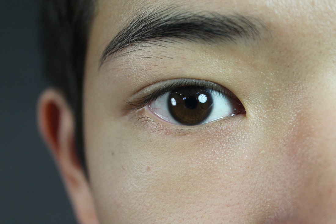
These pictures I took were influenced by Myra Greene, where I tried to incorporate her style and techniques when I was photographing my own. I decided to capture each feature by mostly taking a quarter or half of the person's face at a time e.g, top right (right eye are eyebrow) which I found worked well for the top half of the face I selected some of the pictures that worked best and were most in focus. Unlike other portraits, the background of my subject was a black or dark greyish colour instead of white, as white is usually a lot more harsh and takes away the focus of the picture. I used depth of field to create a focused effect so that the photograph had one focus point by taking the photograph from the side instead of face on.


|


|

|
Second Response
My second response was interpreted by my first attempt at capturing facial expressions like Myra Greene. However, the second time around, I wanted to experiment with different angles and facial expressions to see the effects that they made. Additionally, the lighting was very different, it shone from one angle only, creating a spotlight from one side, shadows onto the other and highlights on the high points of her face such as the tops of the cheeks, brow bone and tip of the nose. I preferred this effect to the first time around that I shot my subjects' features because even though is was a 2D picture, it gave the illusion of a really 3D subject, as if it was more lifelike. Similarly, experimenting with different angles added to the 3D effect because it created dimension and scale.


|


|
|
|
|
Lewis Khan - Georgetown
|
A friend, a neighbour, a familiar face in the street. Georgetown is a view into the life of south london resident, George. "During a period of my adolescence that saw playing football in the street as a daily ritual, George and myself often shared the same space. Frequently we would meet with a simple nod, more frequently a hello, and on occasion George would join in for a kick about".
Georgetown is informed by six years of these impromptu and informal meetings in the street, usually the same one. |

|
Lewis Khan's video shows him following around Georgetown whilst he depicts his background and current life situation to him narrating as the film is playing. It shows us his whole lifestyle including diet, friends, interests and hobbies. The kinds of pictures that he take really reflect Georgetown and project to the viewer what he was like, even without the moving images and the voiceover because his personality is so strong. It seems as if his intentions were to convey to viewers an alternative view of an person's life by challenging the expectations of society of what may be perceived as a normal and open peoples eyes to how others live and what they had to succumb. This is one of the reasons why Lewis Khan's video is so unique and original and why it would attract people to want to watch it.
DT Technician
The DT Technicians' workshop was the fist place I wanted to visit to capture my response to 'Georgetown' because I knew that his work environment reflected his personality the most out of any other work spaces I knew about in the school, just like George's home reflected his own personality. The fact that a smaller room was so overcrowded with equipment and the lack of order intrigued me to photograph all aspects of the room. Items such as the aged books or manuals sitting on the shelves give the person looking at the photographs an insight into what he is interested in and what he treasures. When I went to visit it, we ended up having a conversation on his background, his previous jobs and how he found his current job, and the fact that that happened had given me that initial insight into what he was like and his attitudes towards his job, allowing me to interpret that in a way to reflect what I had learnt about him into my photos. It is also quite an unusual place to photograph because it has so many unusual tools and equipment for drilling etc, which wouldn't usually be in somebody's workplace or home, which made the photos unique and stand out with the unusually shaped tools and bright paint and equipment, making the photos uniquely tailored to his life.
What interested me the most when taking pictures was the smaller details of the technicians objects. For example small labels, the types of books on his bookshelf and the pinned notices handing up above his desk. This is because they seem to be the real indicators of what he was like as a person. Additionally I noticed that the photographs taken under natural light came out much better and less blurry than artificial light because there was a big window space with allowed me to have the light in a bigger quantity and a quick shutter speed resulting in a sharper photograph.
What interested me the most when taking pictures was the smaller details of the technicians objects. For example small labels, the types of books on his bookshelf and the pinned notices handing up above his desk. This is because they seem to be the real indicators of what he was like as a person. Additionally I noticed that the photographs taken under natural light came out much better and less blurry than artificial light because there was a big window space with allowed me to have the light in a bigger quantity and a quick shutter speed resulting in a sharper photograph.


Science Technician
When taking my pictures in this room, the first thing that I had noticed was the array of shelves with blue plastic trays, so I attempted to incorporate them the most to reflect what I saw most in person. I tried to get more pictures of the technician himself in a more formal form of portrait, but it was harder as I didn't think he was as comfortable with it as the Dt technician was. It was a much smaller space so there were less objects to photograph, meaning that the rows of trays was mostly what the space consisted of. This meant that my photos became slightly repetitive because I had only a limited amount of things to take pictures of. However,the positive aspect is that there is an evident theme in some of the photographs due to the repetitiveness of the rows of blue trays placed neatly in their allocated places. I also noticed how there was a very minimal colour scheme made out of mainly blue red and green which perhaps reflected the personality of the subject; ordered and neat. Instead of simply taking the photographs from straight on I experimented with various angles and perspectives in an attempt to make the series appear more varied.


Reception
The Reception was a location which was much more interesting to photograph because each desk was personalised to the person it belonged to. Each corner of the room had its own allocated place for certain belongings which gave it more variation. I was the largest space that I photographed so I had a wider variation of things to explore. However I didn't find that anything particularly stood out as bright and unusual as it was mostly just ornaments and letters. I realised that and the only true indications of character were family pictures placed on each desk which I didn't think the receptionists would be comfortable with me capturing.
One side of the room was a lot darker than the other so had to use artificial light. However unlike natural light it doesn't fill up the room so was concentrated from above (see second picture) as well as the glares from computer screens which stand out. This gives more variation and contrasts along with the other pictures.The light from the window gives a natural shadow to the objects which makes the outcome appear more three dimensional.
One side of the room was a lot darker than the other so had to use artificial light. However unlike natural light it doesn't fill up the room so was concentrated from above (see second picture) as well as the glares from computer screens which stand out. This gives more variation and contrasts along with the other pictures.The light from the window gives a natural shadow to the objects which makes the outcome appear more three dimensional.


How I edited them - Photoshop
This is a simple way of accentuating the colours and making photographs which may seem dull more vibrant and pleasing to the eye. I use this method frequently on pictures when cutting down a collection of shots to a few final ones to ensure they look as good as they can be.

filter>smart sharpen
|

Smart sharpen allows you to have more control over how you sharpen the image as you can alter the amount and the radius and make see before and after comparisons to see how much the sharpening has altered the photo.
|

Image>adjustments>brightness/contrast
this just brings out the colour and is used to avoid washing out any overexposed areas of the photo so that everything is visible. Additionally, for final touches I use the vibrance tool to slightly bring out the colour further to ensure everything is accentuated. |
Genetic Portraits - Ulric Colette
Born in 1979, Ulric Collette, self-taught photographer, studied art and graphic design in Quebec city in the late 90s and now work as art director for Collette, a communication studio in Quebec region.Collette created a series of what she refers to as 'Genetic Portraits'. Each portrait features half of opposing sides of two relatives' faces edited together. Her images allow us to compare the physical similarities of siblings and even twins to the extent where the joined faces make what seem to be only one face. She also explores age differences in family members and the physical effects make it easy to compare them and notice how people are affected by age.
We looked at the work of Ulric Colette to as inspiration for making our own pictures in the same way. Colette's work is so successful in finding faces that fit well together yet have such different characteristics, which is what makes them so unique. Ulric evidently used studio lights and a studio setting when capturing her portraits. This is effective at capturing the peoples' features as there is a plain white background which puts the focus onto the faces rather than the background and every person is well lit so that all their details are captured. I used the same setting in order to produce photos that were as similar as possible to Ulric Colette's so that they look professional and sharp.
We looked at the work of Ulric Colette to as inspiration for making our own pictures in the same way. Colette's work is so successful in finding faces that fit well together yet have such different characteristics, which is what makes them so unique. Ulric evidently used studio lights and a studio setting when capturing her portraits. This is effective at capturing the peoples' features as there is a plain white background which puts the focus onto the faces rather than the background and every person is well lit so that all their details are captured. I used the same setting in order to produce photos that were as similar as possible to Ulric Colette's so that they look professional and sharp.

|

|

|

This portrait is the one that worked the best. This was because the two people that I chose to merge have similar structured faces because they are related so their faces were easier to align and therefore look much neater with a smoother transition from face to face. This is because, unlike the other picture, the two people are related which is the main reason for the successful outcome. However, although I did have the plain white background like Ulric Collette, I didn't have the same studio lights which would enable the best quality of photograph so I had some shadows from the natural daylight which would have made it more difficult to combine the two faces.
|

This is the first generic portrait I did. I had more problems to align each face because they weren't as similar and the jawline and nose were hard to line up. I also noticed after taking the picture that the face on the left was slightly blurry which made it look not as sharp. However, I am happy with the outcome as although the two people are not related they have very similar features - hair, lips and eyebrows - which gives an easy comparison and unexpected yet distorted that lets the viewer wonder what the full face of each person would look like.
|
Canotypes - Sayako Sugawara
Sayako was born in Italy. She currently lives and works in London. In her work she examines memory and imagination and created surreal situations through photographic and moving images by using a variety of platforms including printmaking.
|
|
|
The work of Sayako Sugawara's Canotype prints inspired us to do similar canotypes using natural daylight and then by exposing them to daylight on light sensitive paper and then developing it in the darkroom.

Darkroom
|
We wanted to capture the same effect as Sayako Sugawara's portraits of her children. Firstly we all got portraits taken and then converted them onto transparent paper which we put onto light sensitive paper along with other materials that gave effects to the final outcome. When putting the paper in chemicals instead of putting the whole piece in at once I drizzled them over so that they created a watered effect once fully developed. I also experimented by adding in other faces, materials and by using a brush to wash and flick the chemicals onto the paper so it created patterns (crosses and circles) in the areas I wanted it to. Additionally, I changed up the exposure to light that they got and as you can see, the picture on the right with two faces is much darker than the one on the left, so was evidently exposed for much longer.
However, the most drastic change that I managed to do in the darkroom was the sandwich print, where I incorporated layers of glass and tissue paper to revert the colours into black and white. This effect allowed the viewer to really see in detail where the shadows and points of light had been created which we wouldn't have otherwise seen if it hadn't been reversed. |


|

|
1st Strand My response to Lewis Khan - Nettie
In my response I tried to interpret Lewis' work by showing an insight into the persons' life as much as possible. The person I chose as my subject is a close family friend of mine, who my family know because she was my grandmothers best friend. I thought she would be perfect for this project because her house is filled with pictures an books full of memories and storage that she had never thrown away. Due to her increasing old age her memory is deteriorating, and there were plenty of little notes scattered around the house to remind herself of her daily chores for simple things, such as taking out the compost or turning on the radiator. What I found most interesting was the traditional way of living that included old papers and labels, organised mess, endless books and photo albums and storage rooms for antiques that she no longer used.
I attempted to take some of my photos at an angle so that I could include more in the frame whilst also keeping a focus on a main subject. I used positioning of Nettie to compose the photo in a framed way, took close ups and longer distance shots to get the layout of her room and details of her books and labels. Altogether, the combination gives a good reflection of her living space and how it reflects her, but in order to improve it and uncover more about her characteristics I would say that I would've liked to have explored how she interacts with others inside her home.
I attempted to take some of my photos at an angle so that I could include more in the frame whilst also keeping a focus on a main subject. I used positioning of Nettie to compose the photo in a framed way, took close ups and longer distance shots to get the layout of her room and details of her books and labels. Altogether, the combination gives a good reflection of her living space and how it reflects her, but in order to improve it and uncover more about her characteristics I would say that I would've liked to have explored how she interacts with others inside her home.
Second Strand - Gordon Magnin
Similarly to Lucas Simoes, Gordon Magnin manipulates layers of photographs to create distorted outcomes that challenge the brain's perception. The only difference is that they are created digitally through photoshop so don't have thick layers and are very geometric.I like the order of his photographs and how they seem to be able to fit together perfectly like pieces of a jigsaw puzzle. His intentions were to challenge the perception of the autonomy of the face and challenges what may be perceived as normal. He includes a wide variation of pieces with large parts as well as small ones that are altered and moved around but still allows the viewer to see parts of the original picture and face as an indication of what the portrait should look like.

|

|

|
my responses
To make my edits as similar to Gordon Magnin's as possible by working with different sized and shaped cutouts and copying and pasting them in unusual areas of the face. Similarly, in some areas I left unedited parts of the face to give an illusion of what should be in the edited area. I found that it was much easier to do the larger areas as they were quicker to do (for example the right photo) and for that particular one and the one on the left I made sure that only the areas I had copied were covered with a different area so that the same area of the face wouldn't be shown repetitively in that same portrait. However in the middle picture I didn't necessarily pay much attention to where each copied piece was placed and therefore it has a much more symmetrical and disordered appearance which could be compared to some of the work that Magnin also did (top right).

|

|

|
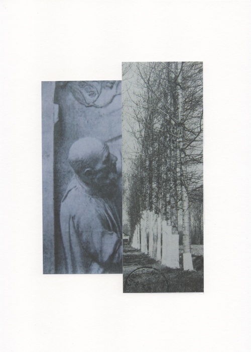
Third strand The Photographic Object - Maurizio Anzeri
Italian born Maurizio Anzeri makes his portraits by sewing directly into found vintage photographs. His embroidered patterns garnish the figures like elaborate costumes, as if revealing the person’s thoughts or feelings. The antique appearance of the photographs is often at odds with the sharp lines and silky shimmer of the threads and adds colour to what once was a much more plain and ordered black and white photograph. He usually searches out photographs in old flea markets and junk shops and layers them with patterns that are sometimes neat and planed or criss crossed into a gigantic mess, where not much is left visible. His surrealist work allows focus wherever he want and unlike general photography, has much more physical manipulation of the final outcome. He also works on modern shoots of fashion models where he wold've had more of an input into the actions of the subject in the portrait, with his sewing design already thought of. Looking at many collections of his over time, it is also evident that over time, he has explored many different techniques of sewing and isn't afraid to venture into layering of string and creating 3D patterns which shows true development as an artist.

|

|

|
My Final Piece
As my response, I was intrigued to begin learning the different ways of sewing and the effects they would have on my pictures. I started off with a pre printed picture of me where I created twirls etc as practice for my final piece. The top right picture by Maurizio Anzeri inspired me to create my own image with string to show an effect of an emotion for my final piece. As I had done some previous sewing on portraits with plain expressions already, I wanted to experiment some more with alternative ways to take and display portrait photographs that previously had consisted of simply pretty patterned string detailing rather than any sort of expression or signs of emotion. I decided that I wanted a stronger subject that had a more intense expression to make my outcome more exiting and eye catching. My idea was that I concentrated my sewing on a few larger areas rather than covering the majority of the photograph so that the focus wasn't taken away from the facial expression. I didn't want to do the exact same as Anzeri as I was afraid the final outcome would look too similar, so I portrayed another emotional reaction to be coming from a different sense; the ear (hearing). I had thought about this before photographing my subject so I knew to frame the face lower down on the picture so that there was space in the top right hand side where the thread would be once it was printed. Additionally, because it was printed on paper I had to layer it down onto card so that it wasn't thin enough to break easily enough when sewing. Unfortunately some areas did tear slightly but there was no significant rips and although some pieces of string did get tied and misplaced in the process, I reached my desired outcome.

|
|

|
